
Dragon’s Eye View
Today on my path to publication, I’m working on new portfolio pieces. One of my stories from my storytelling days is about a dragon called Sir Frederick. In one scene, he is looking for a new place to live. At the end of a long day of flying, he spies a cave and decides to rest for the night.
I have a sketchbook set aside just for Sir Frederick’s character. Before Christmas, I sketched a version of Sir Frederick several times. This morning, I scanned in some of the sketches.
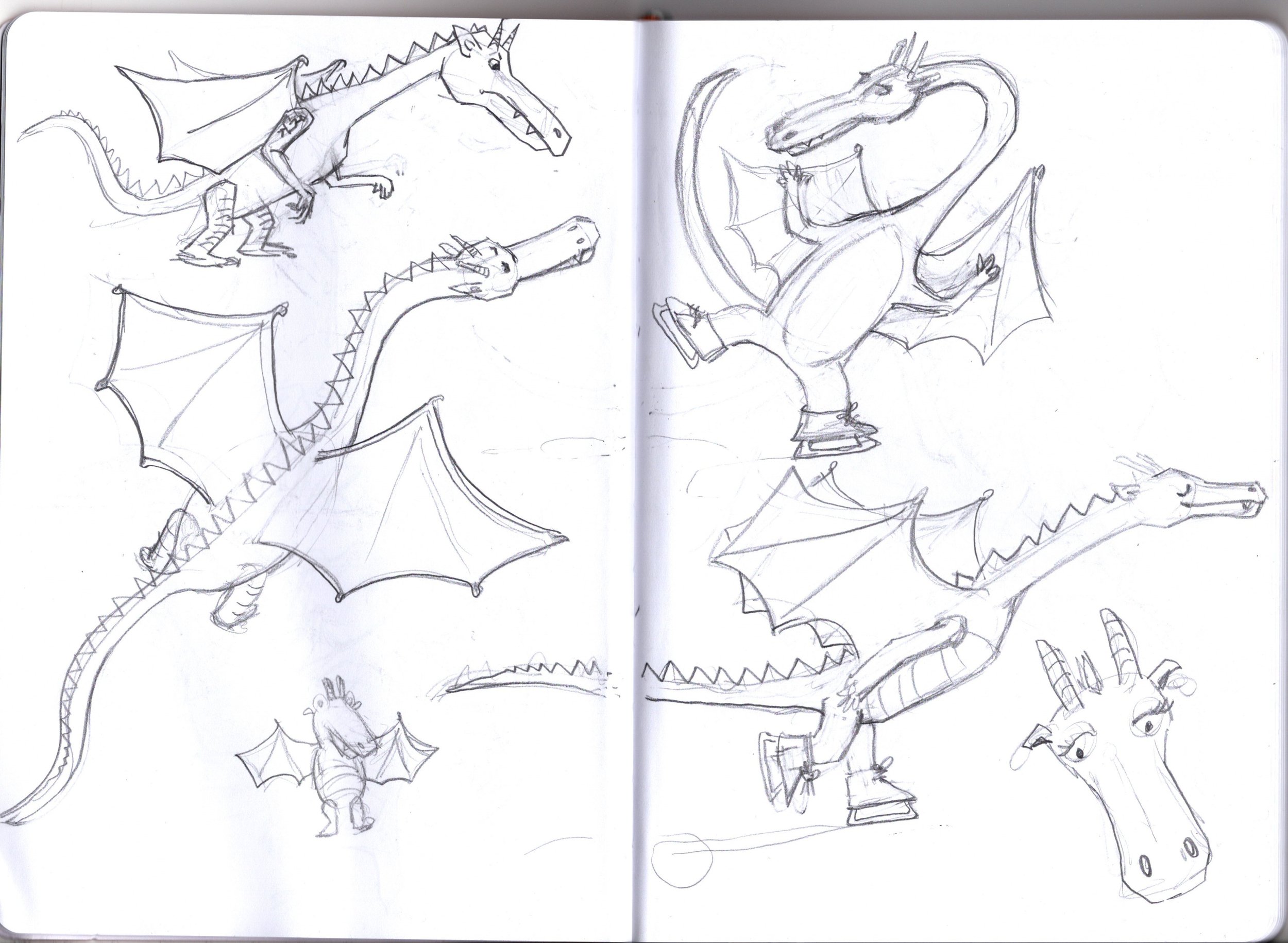
I chose to work with this page and I knew I wanted him flying over his new home down below. I pulled in some bird’s eye view images of mountain ranges. The problem I was having was my sketch of Sir Frederick was top down, but most of the mountain range images I was finding were not looking directly underneath Sir Frederick. And the ones I could find that were top down, didn’t read mountain range in the way I was looking for.
I was either going to need to draw mountains that just looked like terrain and wouldn’t tell the story I was looking for or change the perspective of my sketch of the dragon.
I decided that the mountains needed to help tell the story. So I redrew the dragon and changed the angle we were viewing him from. The drawing went from this

to this:

The next step was to decide on a color palette. I turned to google and searched for dragon color palettes. Of the many options it gave me, I was drawn to this palette.

It has lots of cool temps and warm temps and is not at all traditional. I decided I wanted to go with a seafoam green/blue dragon and warm mountains. I was pleasantly surprised that my drawing had already allowed for me to color block cools and warms in a way that gave me a great silhouette for my dragon and for the lake between the mountains (another important detail for my story).
In Photoshop, I made a duplicate layer of my line drawing and started playing around with color by using the paint bucket and just dropping color into the line drawing. It isn’t the most refined way of coloring your finished piece but I was looking for fast and easy to see what colors were going to work best. I like the result.
I then remembered that the time of day was “Just as the sun was setting”. My initial attempts at creating a believable sunset were bad. I reached out to google again for options for sunsets. I picked this image and started color picking colors from it to see if I could recreate the effect in my image. I’m not there yet, but at the end of my work day, Here is where I am:

It’s still just a color study. I’m going to have to go back and finesse the final details.
I’d love to hear what you think…especially since I’ve got to do the finish details tomorrow!